Niobe website
fields
- UI/UX design
- branding
The design and functionality of Niobe’s website aims to reflect the brand identity, showcase the product, and provide an easy and engaging user experience.
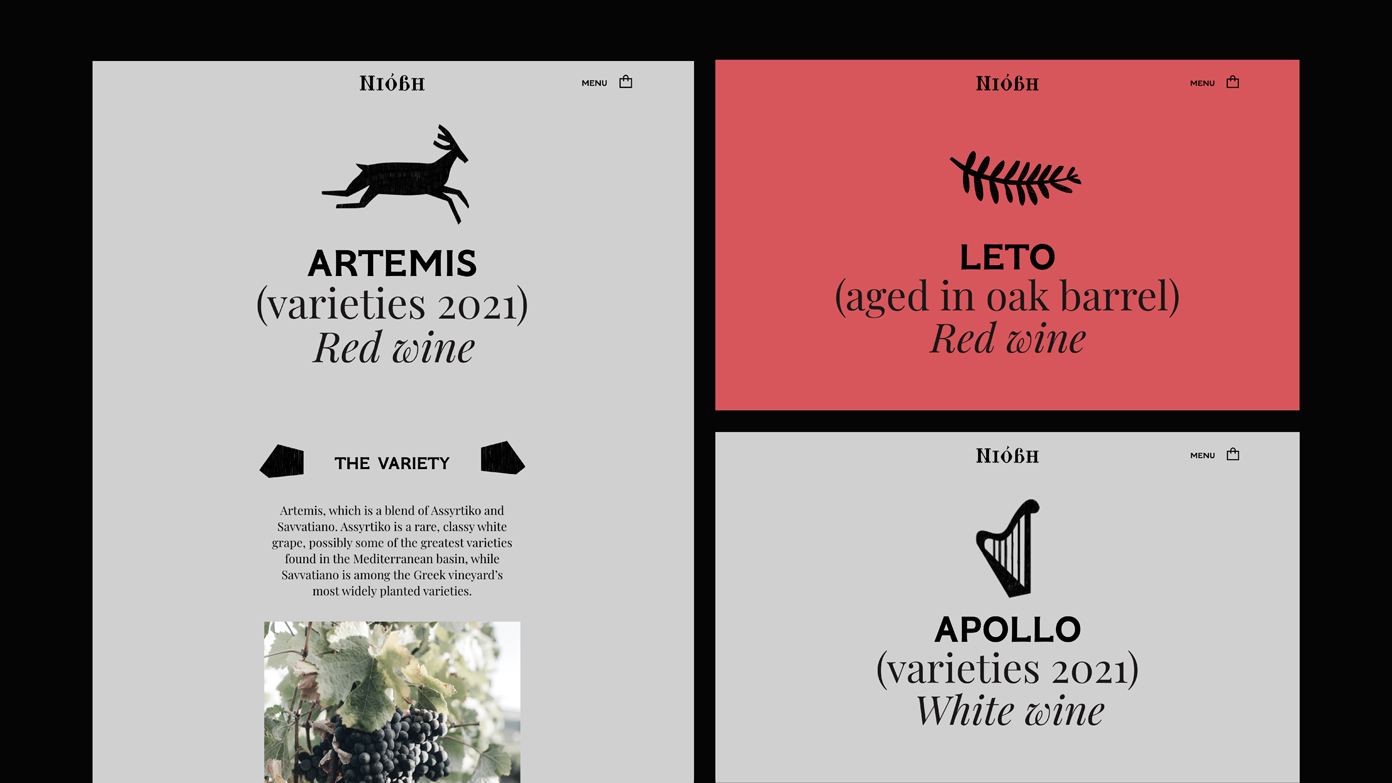
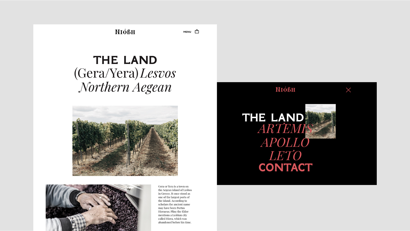
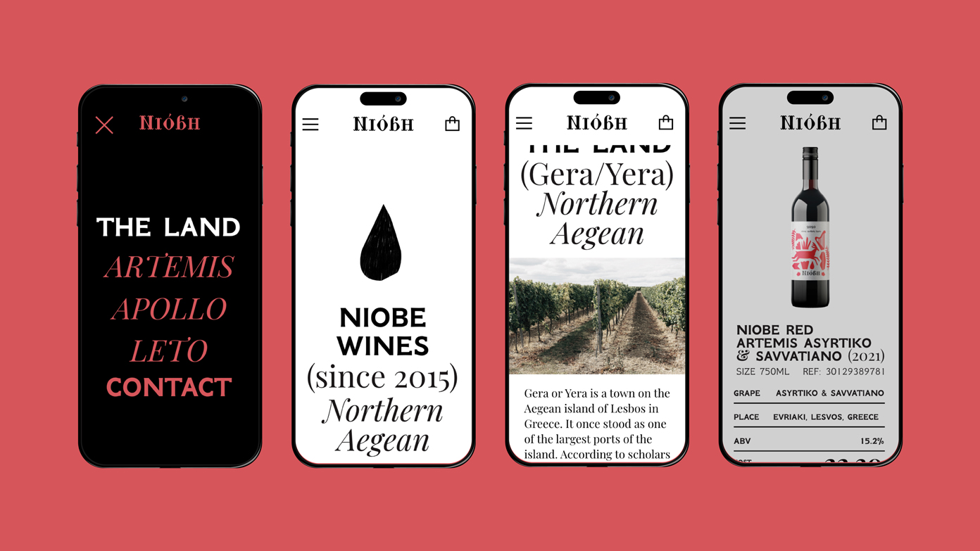
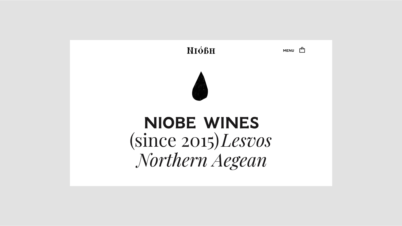
Visual language
The design prominently features clean typography and high-quality imagery, ensuring that the wines’ origin and story are at the forefront. The use of large, bold fonts paired with delicate serif typefaces adds a touch of sophistication, while the imagery of vineyards and winemaking processes connects users to the product’s authenticity.
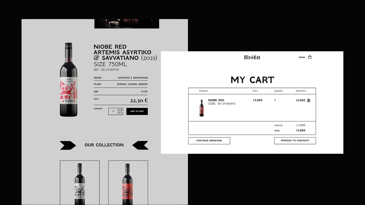
UX Approach
The navigation is simple yet effective, allowing users to explore different wines and their stories with minimal clicks. The clear labelling of sections suggests that users can quickly backtrack or move between sections without confusion. Key information, such as product details and pricing, is displayed clearly, ensuring a seamless browsing and purchasing experience. The design is minimalistic, with a focus on essential content. The use of white space and a limited colour palette keeps the interface clean and uncluttered.